UX and UI guide for creators
It’s of vital importance to us that Decentraland content creators are free to make use of their creativity to its full extent. This is essential for Decentraland to become a rewarding place to explore. However, it’s also important to keep in mind that the scenes in Decentraland will be visited by a wide variety of users and we want to make the scenes accessible to all of them. Because of this, we can’t ignore the need to establish a unified design criteria, a guide that can guarantee that players will find themselves with a homogeneously intuitive and enjoyable experience, no matter what scene they’re on.
In this document we share Decentraland’s Design Values, with the objective of promoting what we consider are the best practices for designing the interface and experience for players. We hope that these criteria can serve as a starting point to build and/or improve the scenes that make up the Metaverse.
Design values #
All scenes in Decentraland should be designed with these values in mind:
- Welcoming: The player feels warmly welcome.
- User-friendly: The UI is easy and fun to use – you should avoid reinventing the wheel
- Easy to learn: Players find the UI familiar and intuitive. Patterns should be consistently used throughout the scene.
- Providing guidance: The scene provides a helping hand. Text, motion, sound and graphics will lead and hint players in the right direction.
- Reactive: Clear action-reaction to players’ input.
- Minimalistic: Less is more. Players can focus their attention on what matters.
- Interesting: The scene takes advantage of the things that make Decentraland unique and worthy of visiting.
- Purposeful: Players have a strong reason to come back.
- Enjoyable: Players enjoy how things look, sound and feel
User experience #
Where to start? #
What is the objective of your scene? Is it to offer a beautiful landscape to contemplate and explore? Is it a museum? Is it a single player game? A competitive one? Or does it follow a linear storytelling flow?
It’s important to be well aware of this objective through every step of the design process, it should guide all of your decisions, all of which can profoundly affect the visitor’s experience.
For scenes that follow a linear flow, where each step depends on the previous, we recommend walling the scene and establishing one or multiple fixed entry points, to avoid players stumbling onto things in the wrong order. By the way, entry points are an excellent place to display a message to welcome the player and explain what their objective in the scene should be.
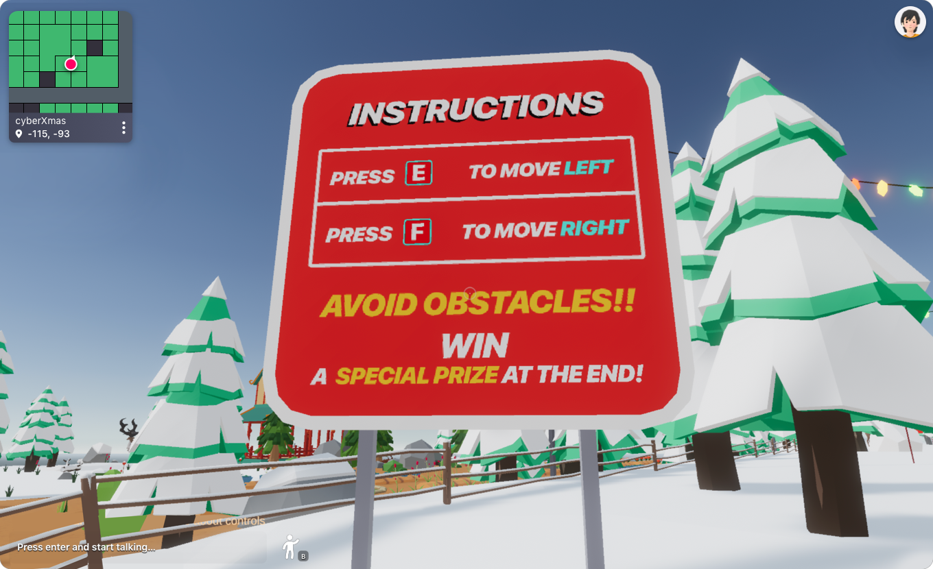
If the player’s experience in your scene isn’t meant to be linear, but you still need to provide some basic instructions to ensure they enjoy it fully, you can show instructions on a pop-up. It’s possible to display a popup on the player’s screen as soon as they enter, regardless of what direction they come from, and in that way make sure that players will always know the essentials.
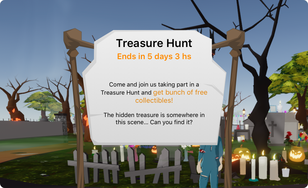
📔 Note: Make sure the popup isn’t too intrusive and that it’s easy to close by clicking anywhere.
A welcome message should communicate the following to the player:
- The scene title
- Welcome the player
- End goal & motivation for the player
- Instructions/Next steps
- (Optional) Controls. Mostly useful if your scene uses global button events. Otherwise, items themselves indicate how to use them when hovering over them.
Motivation #
You’ll likely want your visitors to keep coming back to your scene, think of ways in which you can motivate them to do so! Ask yourself “What would make a player want to return to my scene, or want to recommend it to a friend?”
For example, you can challenge them, giving them something to achieve that will be hard enough to take several attempts. You can also organize competitive multiplayer events, which are also an interesting opportunity to socialize. Make your scene a dynamic place where players feel that they enjoy spending time there!
Feedback and Sound #
Sound plays a double key role, don’t miss out on using it! On one hand it’s vital for generating immersion, many things that won’t feel real if they aren’t accompanied by sound. The other crucial thing sound is for is providing feedback to a player’s actions. If you rely only on visual cues, you can’t be certain that a player will be looking in the right direction to see the effects of their actions. Through using sound, you can ensure that they are aware that something happened. If you use visual and sound cues in combination, hearing the sound invites the player to look around for the visual cue, in case they didn’t see it.
Keep in mind that some players might be playing with their sound turned off. If you’re using sound as a way to provide scene instructions or a key piece in the game mechanics, try to also provide something visual to hint in the same direction. For example, you could display text at the bottom of the UI to accompany these sounds, like subtitles in a movie.
Smart items #
We highly recommend that you read this blog post that shares valuable information about smart items that can aid in the usability and clarity of your scene.
User Interface #
This section is aimed at helping you construct a narrative through the design of your scene that drives the player’s focus onto the elements that matter the most. Making good use of the tools described here can make their experience a lot more immersive and successful.
We can’t understate how valuable color, icons, motion and scale are for sending the right message across: everything in the scene conveys a meaning, remember that.
Layout #
Be careful about placing your UI in screen regions that overlap with the default Decentraland UI elements. The default Decentraland UI, including minimap, chat, etc, is designed to only cover the left 25% of the screen. The rest of the screen real estate is a safe zone, free to use for content creators.
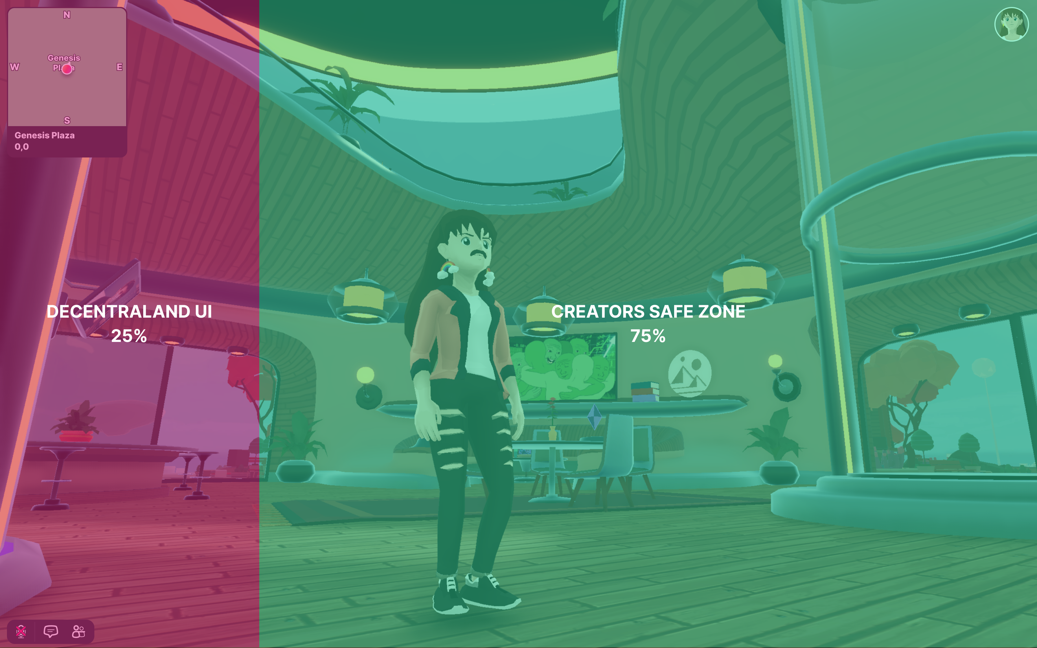
There are no restrictions for placing UI elements in the left 25% of the screen, but keep in mind that the explorer is continually making changes and improvements to its design. Any space that is not occluded in that region today could be covered in future versions.
📔 Note: UI elements from scenes and smart wearables always appear on a layer behind the default Decentraland UI.
Always keep a grid in mind and use it as your main criteria when spatially organizing your UI. If you are working on a scene where a HUD is needed, you can start by putting all the consumables together (e.g. currency, food, life), and on the other side stockables such as tools or weapons. Try to be consistent about the grid metrics and padding. Make the feedback for every player action clear.
Color #
It’s important to choose a color palette, as this gives your scene an identity and also signals relationships and hierarchy between elements.
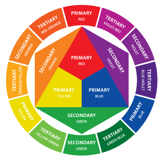
When putting together a color palette, start out by selecting a main color, and optionally a secondary one. Then you should decide if you want the palette to be analogous, complementary, or triadic, etc, in relation to that main color.
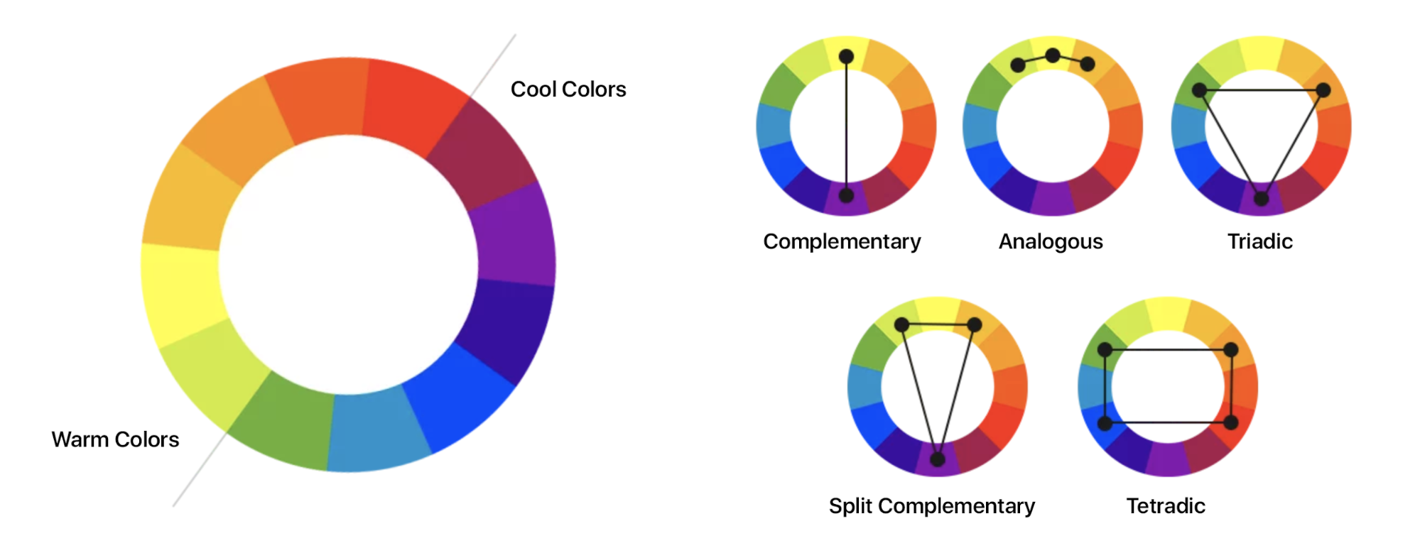
💡 Tip: Free color palette generators we recommend: Coolors, Adobe Color CC, Colour Lovers, Color Hunt, Color by Hailpixel, Colour Code, Sip, Color Scheme Designer by Paletton, Cohesive Colors, Colr
The main color should be the most frequently used across your UI components. If your palette doesn’t have a secondary color, you can accent elements by combining the main color with black or white. Having a secondary color is not mandatory, but it helps emphasize and distinguish your scene UI elements. Secondary colors work best for highlights, selection controls (sliders and switches), links and headlines.
Remember that each color has its own unique expressive qualities, take advantage of that to communicate messages through them. For example, red is often associated with negative connotations whilst green is associated with positive connotations.
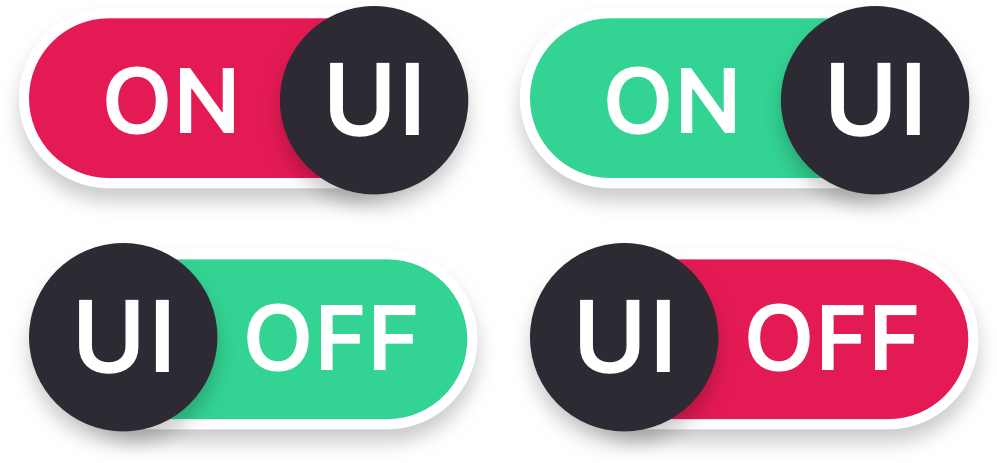
You can also use colors strategically to indicate state changes, for example changing the color of an element to indicate if it’s active or inactive.
📔 Note: States communicate the status of UI elements. The states of an element should maintain a certain continuity, but they must have clear affordances and be easily distinguishable from other states and the surrounding layout.

Warning! When selecting colors that will be shown in superposition, take special care of making sure that they are legible when used together. Here’s a fundamental rule: the colors of elements that are shown together should always have plenty of contrast between them. Be mindful that some players might be looking at their screens under suboptimal lighting conditions, which makes reading harder.

Typographic hierarchy #
Try to define at least a 3-type scale for Titles, Subtitles, and Body. Be careful with the use of color and font size. All font sizes should be 12 px or larger.
If you are going to place text that is displayed over imagery (or over the world), you will surely need to experiment with its legibility. In those cases, we suggest that you add a colored solid region, in a layer between the text and images, that way you can ensure that the text remains legible.

Icons #
Icons synthesise information, helping you identify actions through images. They are an amazingly powerful tool for providing input that can be interpreted fast, as opposed to using text to label things, which demands more of the player’s attention and time. It’s also useful to show icons in combination with text, as this helps disambiguate their meanings.

Motion #
Use motion to provide feedback and lead the way when needed. Motion helps players focus their attention and helps maintain continuity as the UI changes.

Writing and content structure #
UI text can make interfaces more usable and gives players more confidence in their actions. Always make UI text as concise as possible. Players are there to play, not to read. Any text that seems too long won’t be read by most players.
Receive your players with a Welcome Message and tell them the objective of the scene. Start by clarifying their goal in the scene, then the actions needed to achieve it. Then you can reveal information progressively as it’s needed, this way players won’t feel overwhelmed on the very beginning of the experience. As with graphic resources, try to use consistent words across your UI features and storytelling.
SDK New Features - Coming Soon!
Objects interactions Now it’s not possible for players to tell which objects are interactive and which aren’t, until they actually click or press buttons on them. We have been working on a new feature for creators to be able to show custom toast messages when aiming at an interactive object. This message conveys which input to use and may have custom text to describe the effects of interacting with it. We highly recommend that you use it when released, your scene will feel more natural and easy to use.
3rd person camera We’re currently experimenting with adding support for a 3rd person camera. You can try it out in the explorer by hitting the ‘V’ key. (Note, it’s not supported yet in a scene preview). You can start thinking of developing incredible new experiences or games that might be much more appealing thanks to a 3rd person camera!